
USC WEB REG
Making course registration at USC seamless, smart, and stress-free.
TEAM PROJECT
TIMELINE
4 Weeks
ROLE
Product Designer
SKILLS
UI/UX Design, UX Research, Figma
JUMP TO FINAL
PROBLEM
Let's face it: registering for classes is not easy. It involves spending huge amounts of time to hunt down information on the internet, keep track of all your findings, and synthesize it into a cohesive schedule.
The results? Well, students...fail to complete their minors, drop out of classes, watch their gpa drop, end up with an unbalanced schedule that causes burnout…the list goes on.
The single consistent factor is stress.
The results? Well, students...fail to complete their minors, drop out of classes, watch their gpa drop, end up with an unbalanced schedule that causes burnout…the list goes on.
The single consistent factor is stress.
COURSE REG
AT USC IS INEFFICIENT,
OVERWHELMING,
AND PAINFUL.
AT USC IS INEFFICIENT,
OVERWHELMING,
AND PAINFUL.

Above: A mere handful from the army of tabs cluttering my browser during course registration time.
RESEARCH
We needed to find out more. Conducting user interviews with 10 current USC students ranging across all grades, we asked: "hey, what's the most frustrating part of registering for courses?"
"I got so overwhelmed,
I skipped my registration
time. It's been two
weeks...I'll just suffer the consequences."
I skipped my registration
time. It's been two
weeks...I'll just suffer the consequences."

Hypothesizing, gone wrong.
We thought the problem was the checkout system. Upon clicking 'checkout', students would find themselves unable to register their whole bin because a single course had become unavailable in a matter of seconds.
Then, students would have to re-navigate to their course bin (or back to the course catalog entirely) and redo everything…all the while knowing that every second that passed meant less courses available.
We ideated for hours on a solution to this specific problem, only to later find the truth impossible to ignore: the problem was much larger than an inefficient checkout process.
So, we scrapped it all and started from square one. What's the real problem, here?
Here's what we found:
Course registration at USC, from planning to registration, is littered with frustrating inefficiencies, disconnects, and roadblocks.
IDEATION
Luckily, our user interviews provided many ideas for solutions as well.
Students could clearly see why the process was inefficient, and had various suggestions.
“I wish my department gave me a four year course plan template.”
“What if there was an AI or something that could suggest what your schedule should look like?”
“I wish ratemyprofessor.com was more accurate…”
Our team as well came up with various ideas for features:
1. An AI that could tell you how likely you would be able to sign up for a popular course
2. Automatically showing what courses you need to take for your major & minor(s)
3. Displaying progress towards completion of major & minor(s)
Prioritizing for Time Constraints: Defining the MVP
Given that we had 2 weeks to complete our pitch deck and rough solution, I had to come up with a barebones version of our solution that would be worth pursuing.
So, I asked myself: what do we need so that user can register for courses in a single tab?
So, I asked myself: what do we need so that user can register for courses in a single tab?
MVP ARCHITECTURE

What if instead of needing 30 tabs to register for courses, you only needed one?
Plan.

First, use the Course Browser widget to populate your course plan.

Personalized For You.
Our Course Browser suggests courses for you based on your student information.
Find What You Want, Faster.
Our search accepts any keyword to generate results, whether that be department, professor, or course topic.
Our Course Browser suggests courses for you based on your student information.
Find What You Want, Faster.
Our search accepts any keyword to generate results, whether that be department, professor, or course topic.

Once you're satisfied with your plan, give it a name, save, and you're ready to start Scheduling!
People change, and so do their plans. One of the greatest sources of student's stress was having to manage "multiple backup plans" for their schedules. Being able to keep multiple 4-year plans in storage is a necessity.
People change, and so do their plans. One of the greatest sources of student's stress was having to manage "multiple backup plans" for their schedules. Being able to keep multiple 4-year plans in storage is a necessity.
Schedule.
When you click "schedule", your selected course plan will automatically load your course bin with the courses in your plan.

As you're making final tweaks, see if courses in your course bin conflict with each other instantly.
If it works, just click schedule!
If it works, just click schedule!

And if it doesn't... just pull up the catalog browser again!
Finally, checkout!
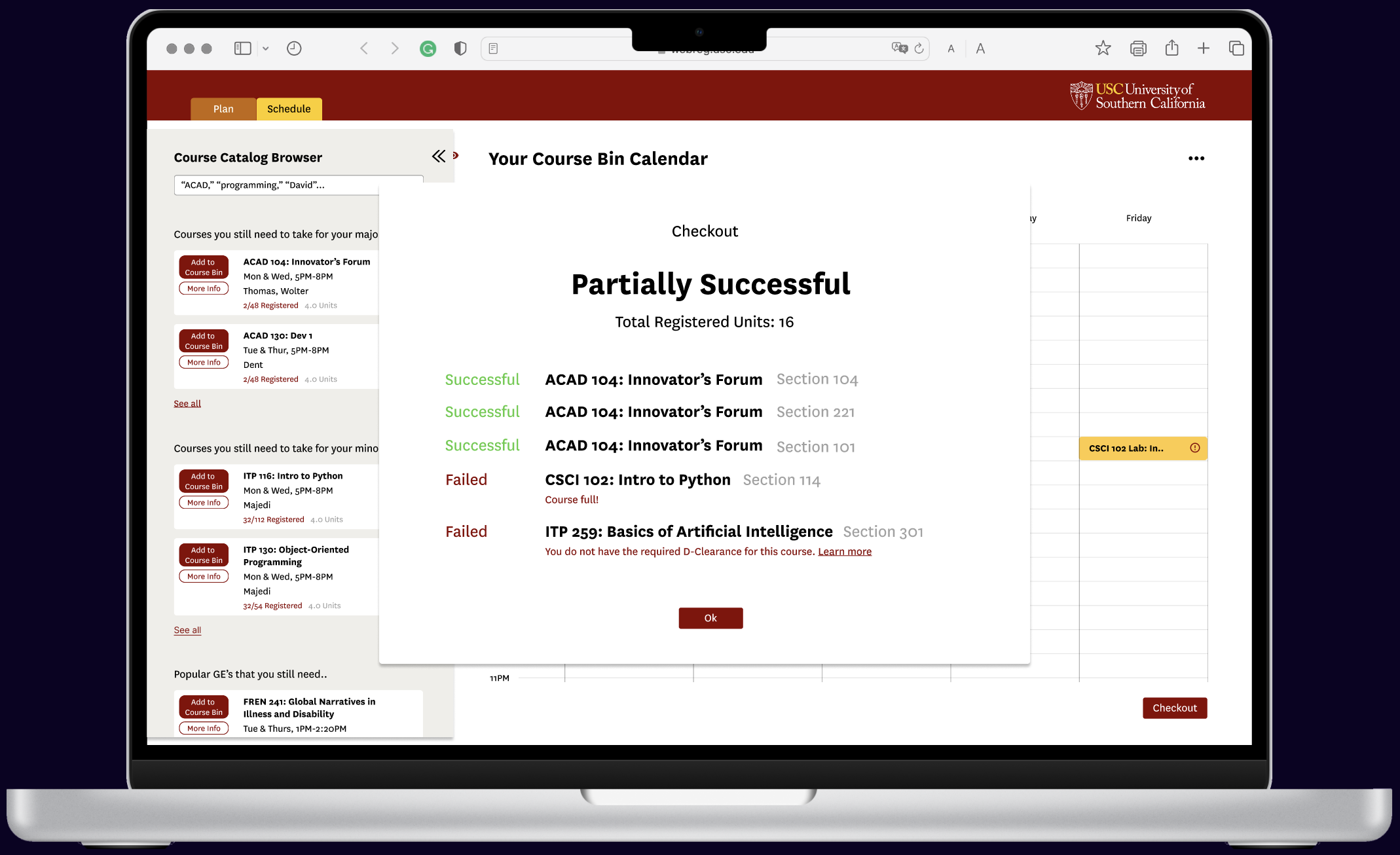
Instantly see if courses failed to register and why. Return to the course bin to try again with just one click!
ITERATION
Highlights from various rounds of changes I made.
Even Clearer.
The 4-year plan interface initially used color alone (top) to distinguish between which classes counted for a major, minor, or GE.
Two issues: 1. Inaccessible. 2. Looks Overwhelming.
Adding a tag was a simple solution that improved clarity, added cohesiveness, and made the design accessible to colorblind users.
Two issues: 1. Inaccessible. 2. Looks Overwhelming.
Adding a tag was a simple solution that improved clarity, added cohesiveness, and made the design accessible to colorblind users.

Even Simpler.
Our initial solution consisted of three tabs: Plan, Schedule, and Checkout. We assumed this structure was most efficient, most likely influenced by Web Reg's existing structure.
But, users said they wanted instant feedback on whether their checkout was successful. Why should they have to navigate away from the calendar?
So, Checkout was integrated with Schedule, to allow for speed class replacement.
But, users said they wanted instant feedback on whether their checkout was successful. Why should they have to navigate away from the calendar?
So, Checkout was integrated with Schedule, to allow for speed class replacement.


Even Better.
Even more features we added to get closer to a single-tab, stress-free registration:
Smart Alerts
Progress Tracking on all Majors and/or Minors
Smart Alerts
Progress Tracking on all Majors and/or Minors


A note on design
The color palette and fonts from the existing USC web reg were used so as to avoid confusion for USC students when using the product.
However, UI design was not the focus of this design sprint; rather, I focused on refining the core functionality of the product and ensuring that it fit with user needs.
However, UI design was not the focus of this design sprint; rather, I focused on refining the core functionality of the product and ensuring that it fit with user needs.
SUCCESS METRICS & KPIS
Quantitative
1. Average time spent on site per student
2. Success of registering backup plans
3. Time spent on registration after initial registration attempt
4. Responsiveness of website
5. Retention rate
1. Average time spent on site per student
2. Success of registering backup plans
3. Time spent on registration after initial registration attempt
4. Responsiveness of website
5. Retention rate
Qualitative
1. Follow up surveys with users
Future
1. Number of dropped courses over the semester
2. Course satisfaction
1. Follow up surveys with users
Future
1. Number of dropped courses over the semester
2. Course satisfaction
By tracking these statistics and cross-checking qualitative feedback with the numerical data, we can monitor how the new Web Reg is truly saving students time, energy, and stress.
FUTURE ROADMAP
Course recommendation AI
Autogenerate course plan & course bin
Professor and course satisfaction display
Autoload backup plans
on fail
on fail
We would determine which features to tackle first based on user feedback on what matters most to them.
TAKEAWAYS
Get to the roots.
If people are getting hit by debris falling from a cliff, do you ask, why is the debris falling? (Hint, gravity). Or, do you ask, why is the cliff crumbling?
Users can identify specific roadblocks they're facing, but sometimes those roadblocks are byproducts. Keep asking yourself, "But why?"...until you get to the root of the problem.
Users can identify specific roadblocks they're facing, but sometimes those roadblocks are byproducts. Keep asking yourself, "But why?"...until you get to the root of the problem.
Your users are your friends.
Nobody said that product designers have to come up with all the ideas on their own. Users have desires and pain points that translate directly into features. Sometimes, they already know what'd they'd like to see.
It's up to us to determine how to make it happen, the best it can happen, without creating additional problems.
It's up to us to determine how to make it happen, the best it can happen, without creating additional problems.
Signing off! -Elissa.
P.S. USC Web Reg won second place in ProductSC's annual case competition!